ROUTABLE BRAND REFRESH
Standing out in the enterprise FinTech space with a redefined brand.
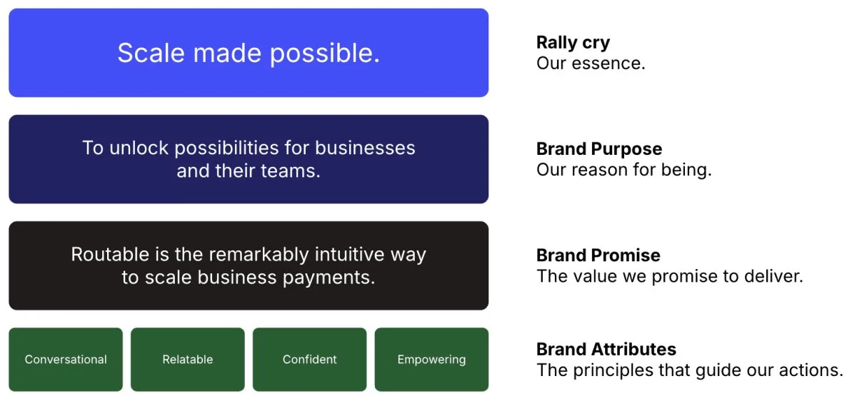
Routable, a leader in accounts payable automation, needed to stand out in a crowded market while reinforcing its mission to help businesses scale their payments — captured in the new internal brand rallying cry "Scale made possible."
To support business and marketing goals, I led the development of a distinctive brand system, including unique positioning, visual identity, and voice. This refresh elevated brand awareness, strengthened market differentiation, and positioned Routable as a trusted partner for growth and efficiency in the B2B financial space.
PROJECT GOALS
Redefine Routable’s brand story to reach enterprise clients in a crowded Accounts Payable space.
Formalize tactical visual and tonal guidelines for internal creatives and external partners.
MY ROLE
Brand strategy
Creative direction
Digital design
Video production
DEFINING OUR WHY
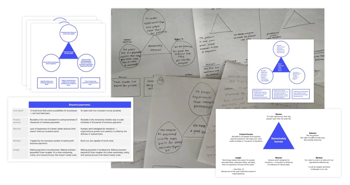
Because Routable exists in a crowded B2B financial space, standing apart was critical. We leveraged the Challenger Brand framework to uncover the core truths of how and why the brand was different. Through positioning workshops that I led with key executives and crossfunctional leaders, I narrowed in on a sharp point of view about the world and our place in it: there is a better way to help businesses scale their payments — and Routable is uniquely positioned to deliver it. This exercise clarified our unique role as the remarkably intuitive method for scaling business payments — and a north star for the brand expression we would develop next.
REFRESHING OUR VISUAL LANGUAGE
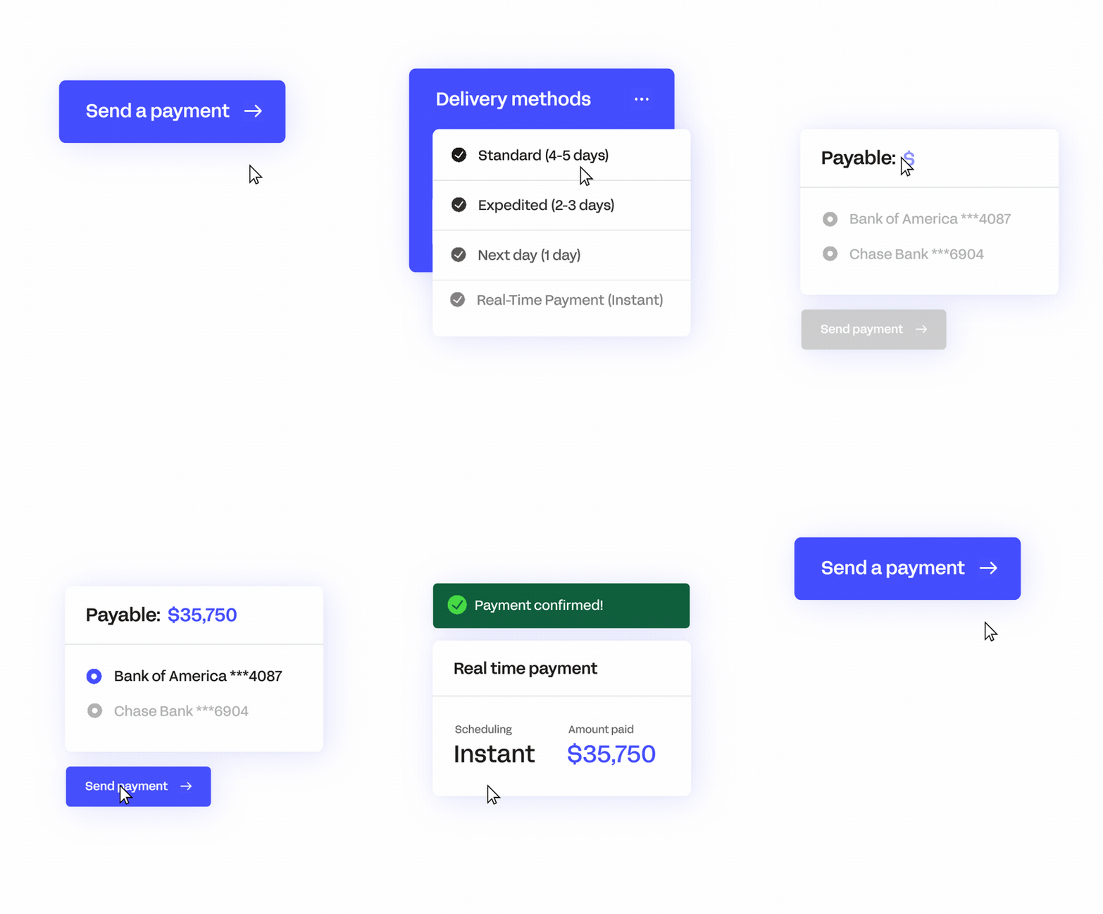
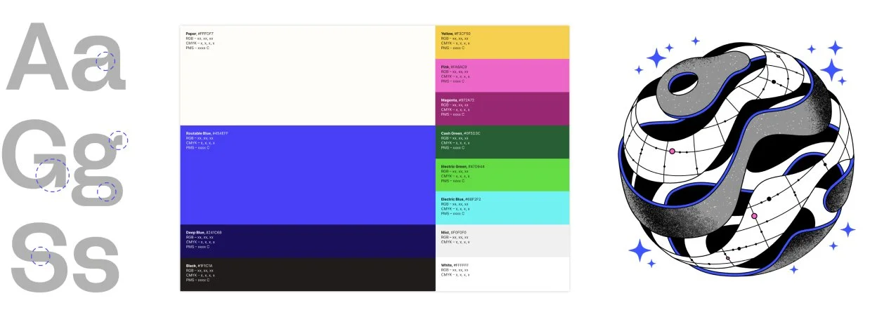
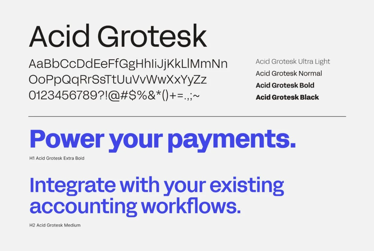
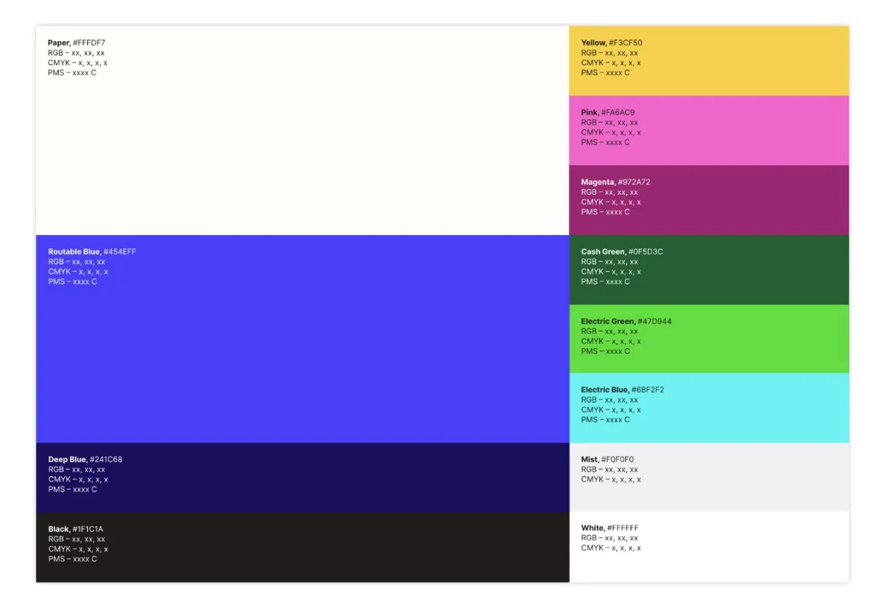
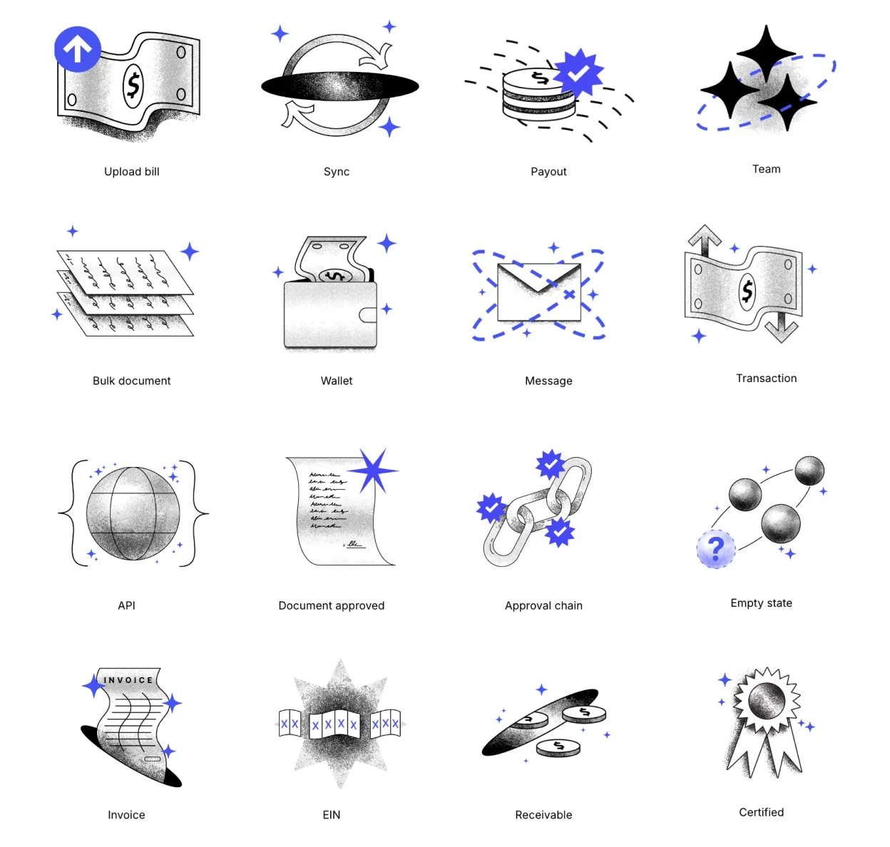
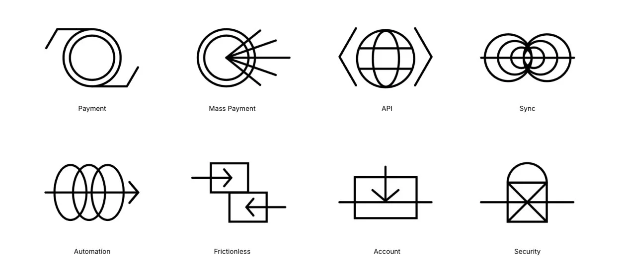
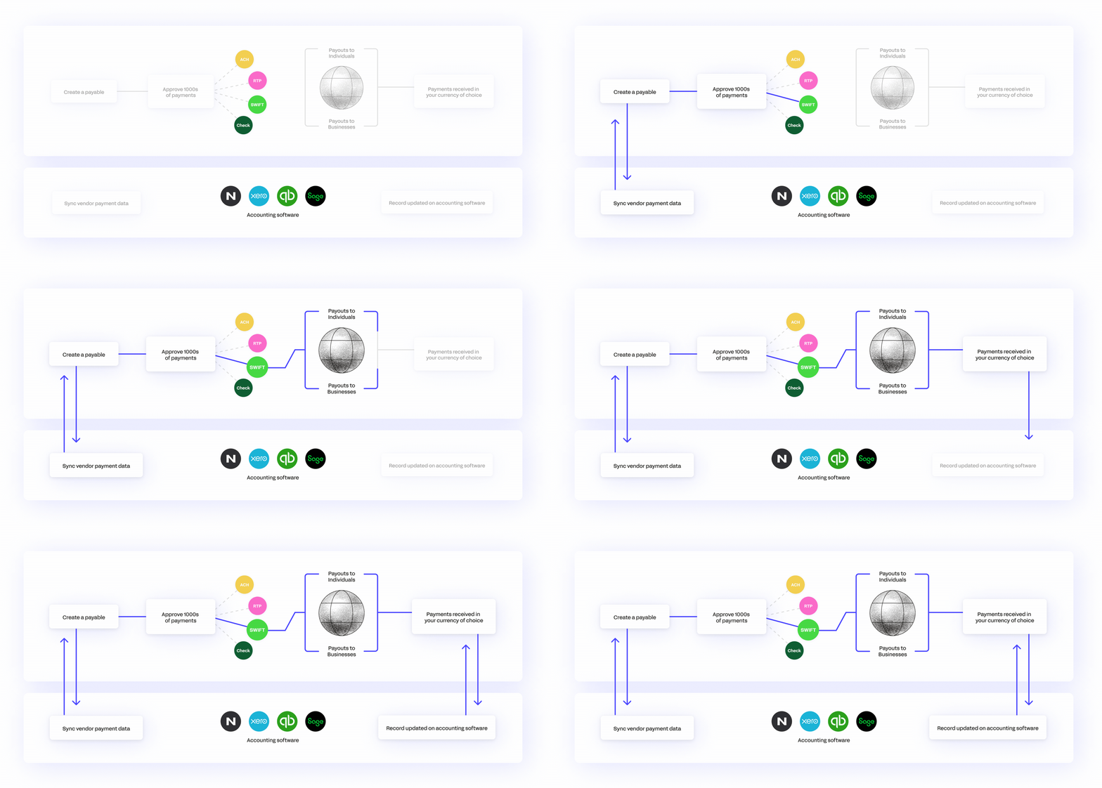
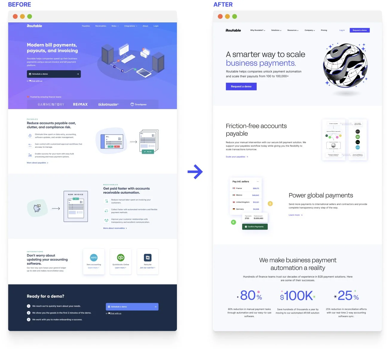
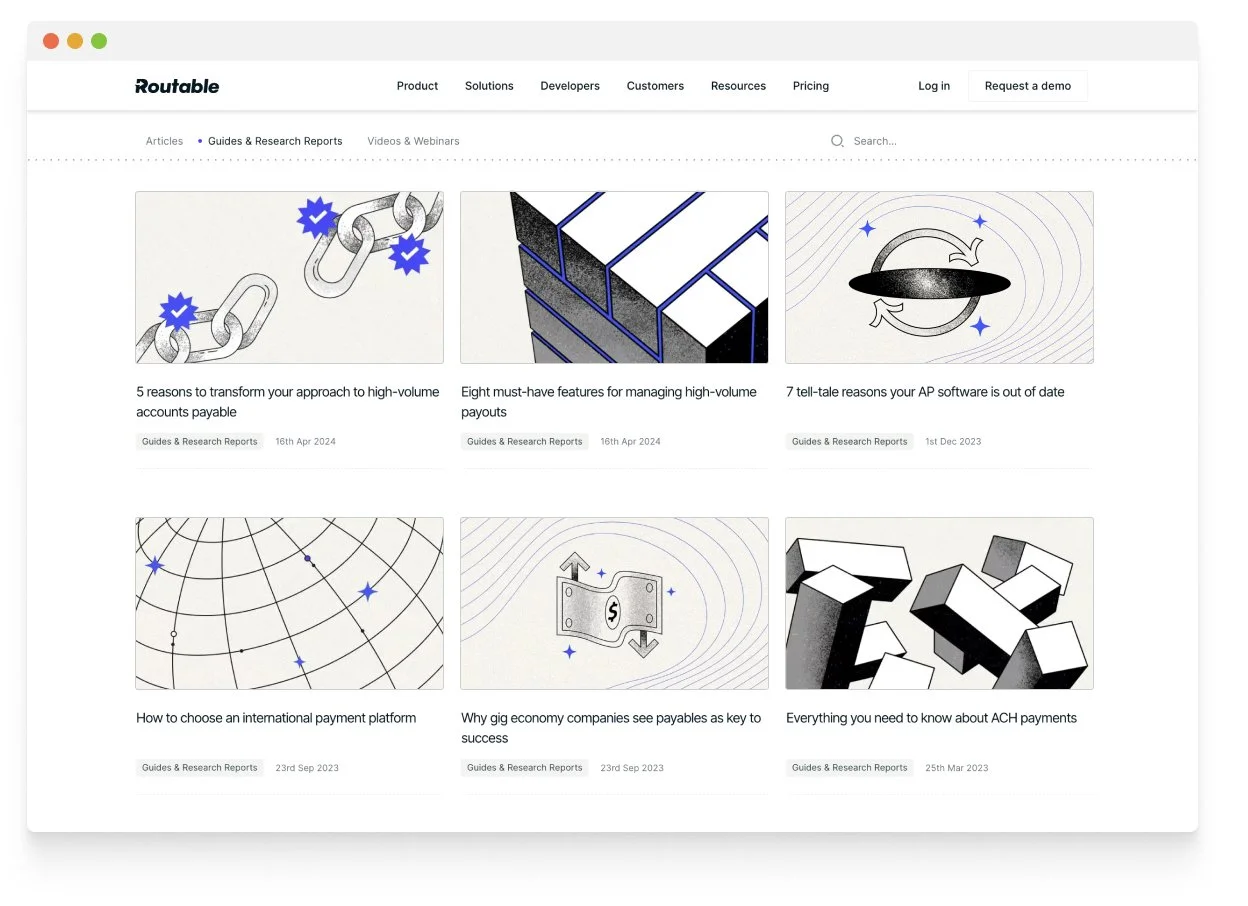
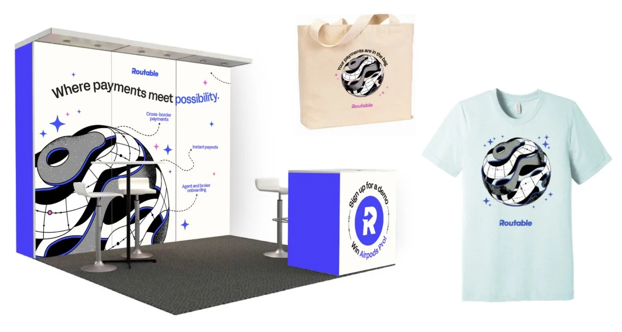
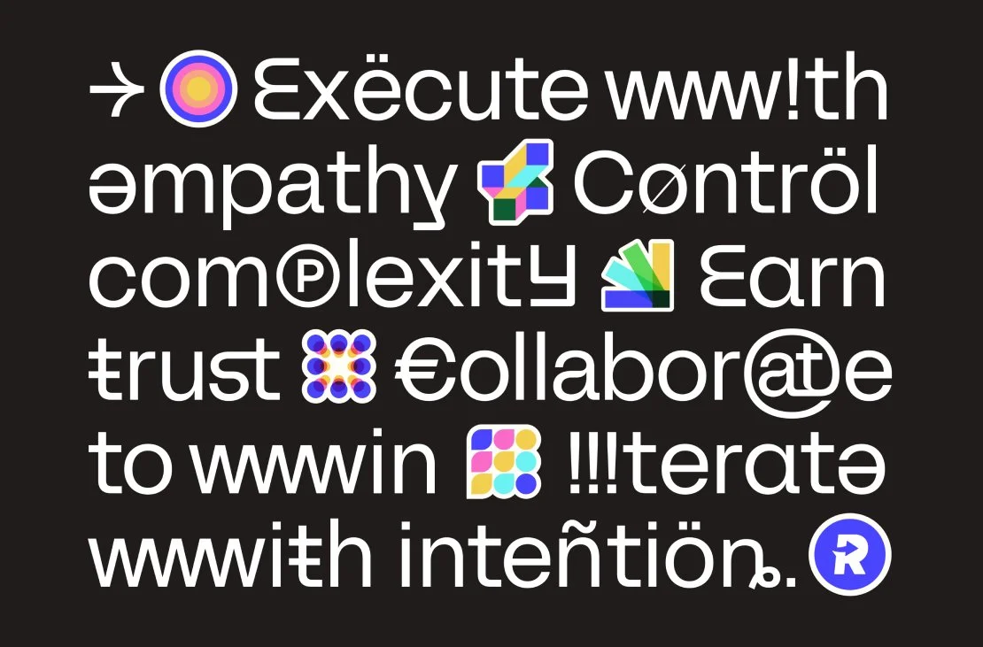
To elevate Routable’s appeal from small and medium businesses to enterprise-level clients, we refreshed the brand’s visual language with a focus on futurism and scalability. The updates included refining the logomark for a cleaner, more polished look, introducing a bold new display typeface, and infusing the color palette with energy and vibrancy. We also developed a futuristic illustration system that balanced modernity with possibility, ensuring flexibility across various applications.
This refreshed visual language was thoughtfully scaled across marketing and product touchpoints, creating a cohesive and professional brand experience that resonated with larger, enterprise-level audiences.
SCALING ACROSS THE EXPERIENCE
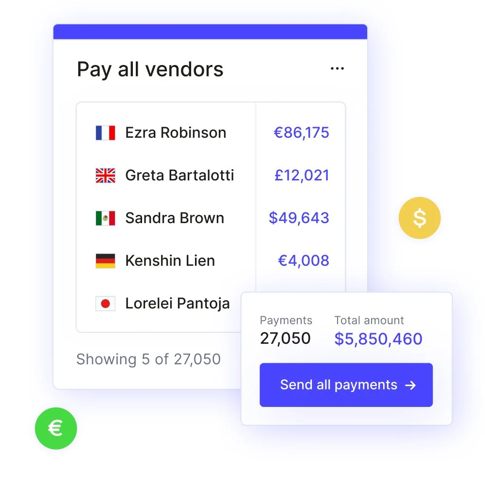
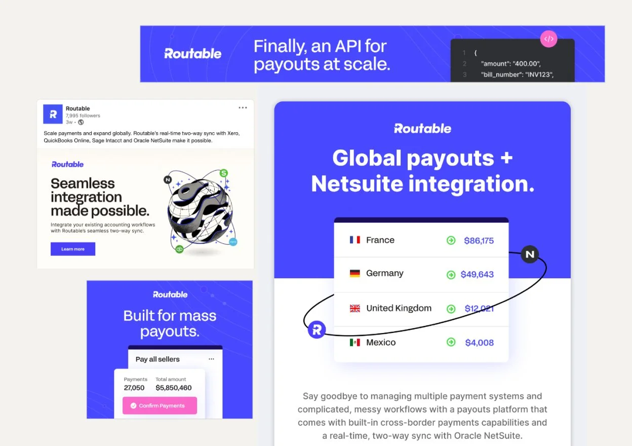
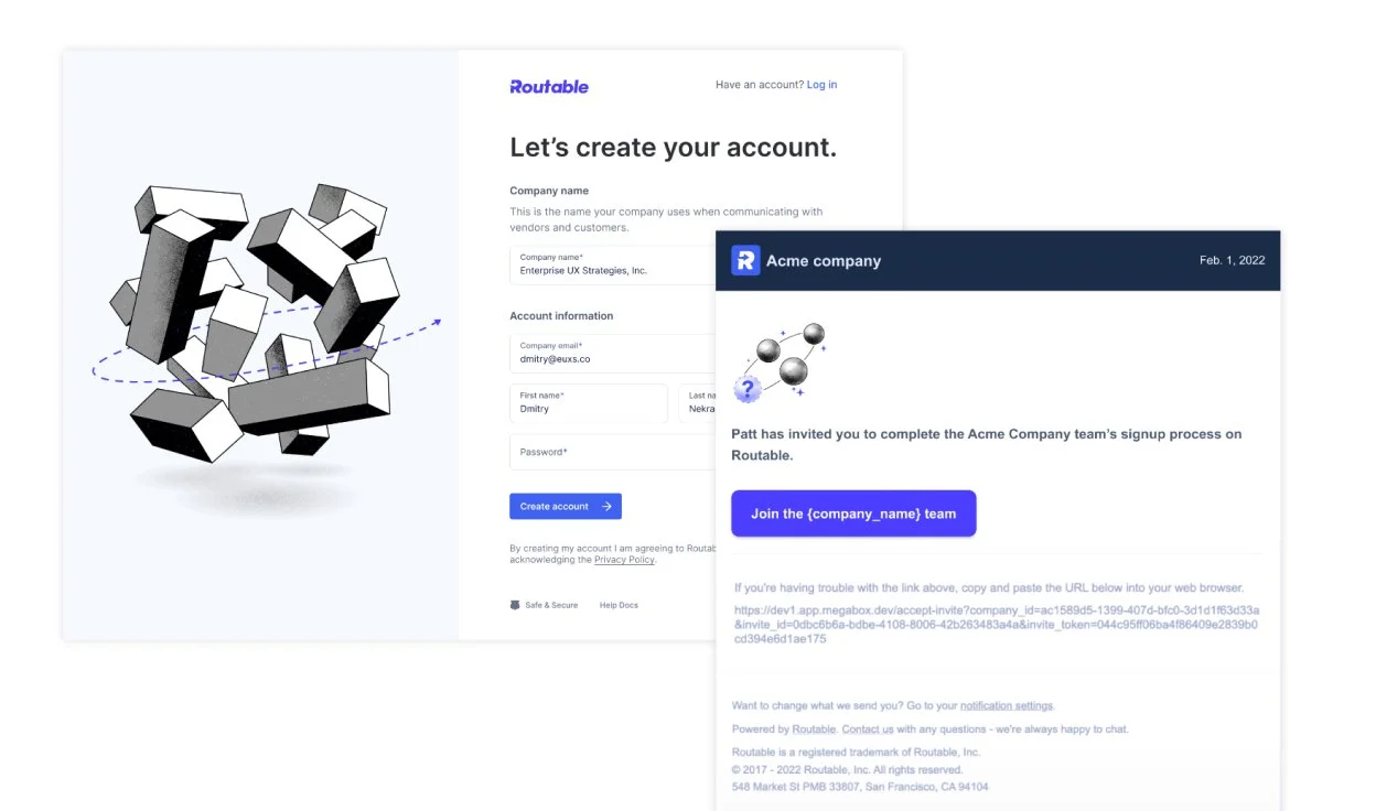
This refreshed visual language was thoughtfully scaled across the website, product onboarding flows, tradeshow booths and materials, and top-of-funnel marketing assets, creating a cohesive and professional brand experience that resonated with larger, enterprise-level audiences.
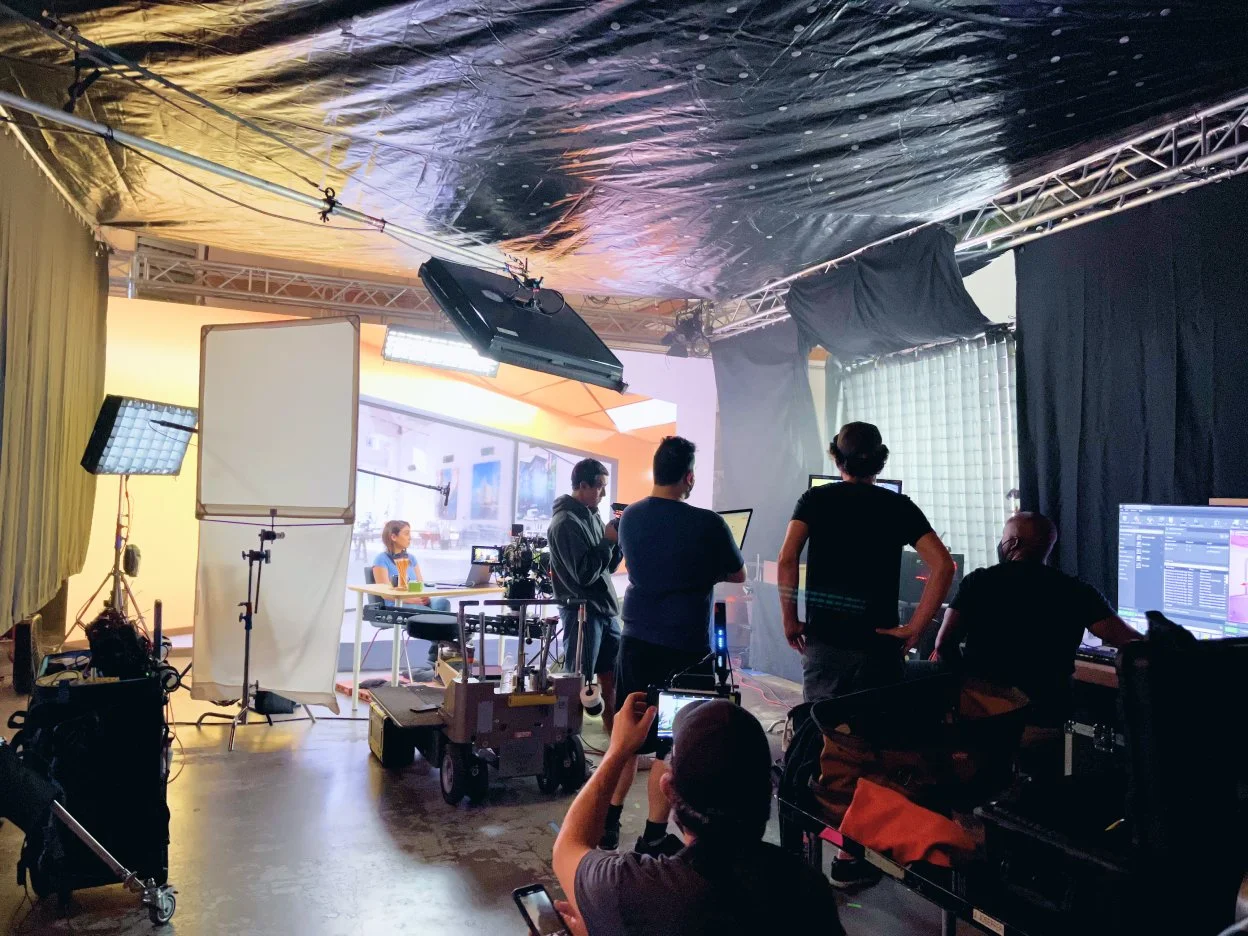
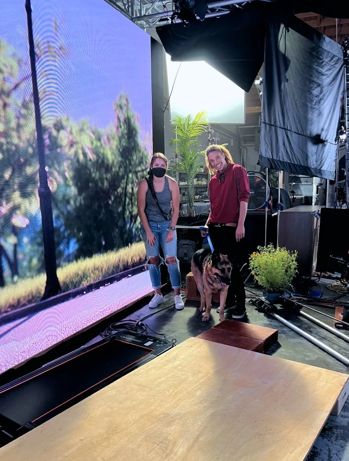
To bring the refreshed Routable brand visual and tonal language to life in motion, we developed video ads targeted at our two highest-value audience verticals — Marketplaces and Gig Economy companies. The 60 second core videos were cut down to 30 and 15 second cuts to leverage on paid social. We leveraged an LED screen digital background to create dynamic video ads, simulating diverse environments in a controlled studio setting, which offered creative flexibility and streamlined, cost-effective production.
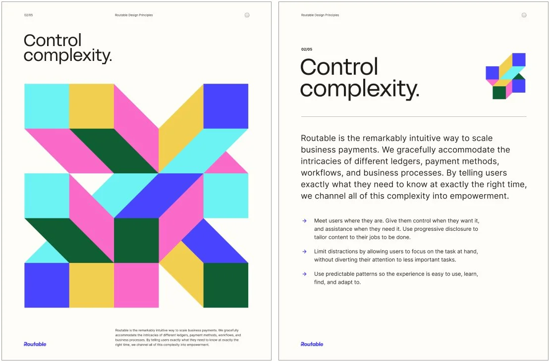
We also scaled the brand system to an internal Design Principles initiative. Alongside Product Design Directors, we developed 5 values, core to the organization’s design process — aimed at establishing guidelines to shape all creative and product decisions. These principles aligned teams on a shared vision and provided a foundation for scalable, user-focused design — while carefully considering the new brand positioning and visual language.
All members of the product, engineering and design orgs were given swag items like posters, stickers, and hoodies to socialize the principles.
