THUMBTACK BRAND SYSTEM
Defining a differentiated design language in a crowded category.
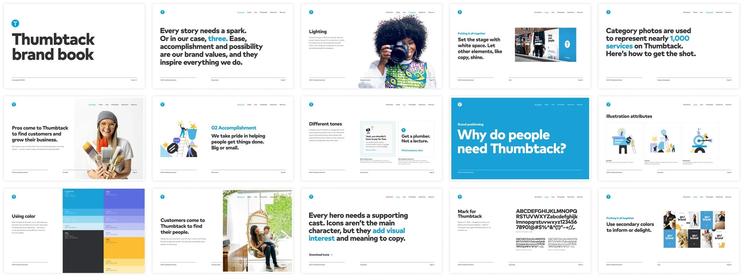
After a major rebrand in 2018, the Brand Creative team set out to create a single source of truth for all things brand — design guidelines, voice and tone, and story. I led the team to drive consistent brand expression across top-of-funnel assets, and create exhaustive guidelines to effectively direct creative partners and vendors to produce on-brand assets. We landed with two distinct deliverables: a formalized brand guidelines book and a publicly-facing brand expression site.
Clarify Thumbtack’s brand expression to empower the organization to ship product updates and campaigns that tell a consistent brand story.
Formalize tactical visual and tonal guidelines for internal creatives and external partners.
PROJECT GOALS
MY ROLE
Brand strategy
Design direction
Creative production
DEFINING THE STORY
The 2018 rebrand set us up with the what: logo, color, and type. Our next task was to clarify the why and the how: the story we tell, and how we would express it across all touchpoints.
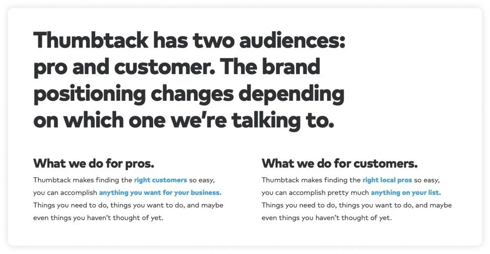
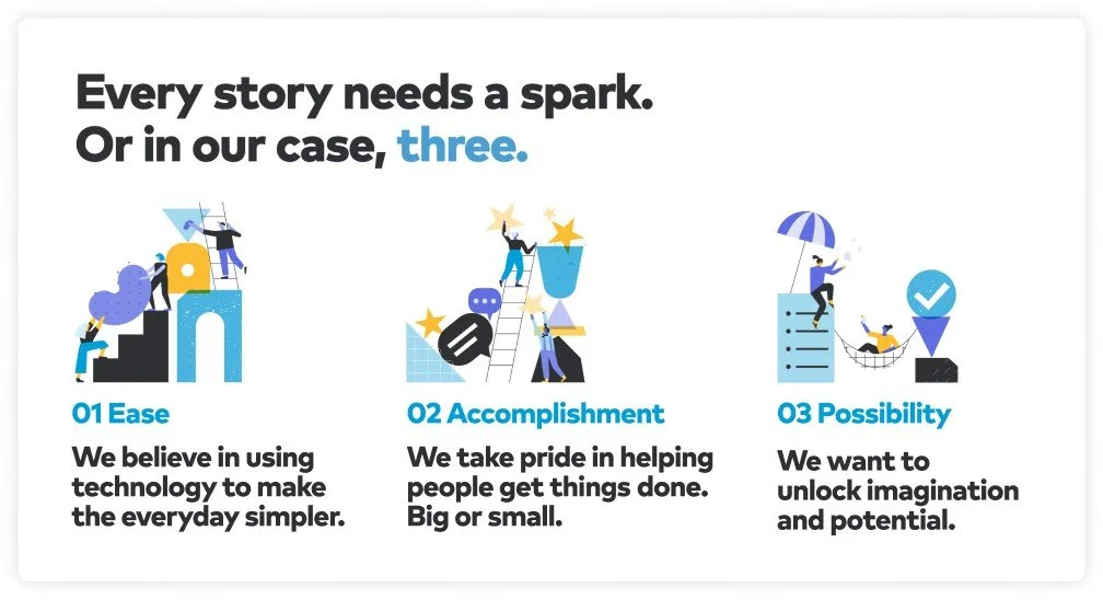
We started by asking ourselves questions about how we behave in the world, how our mission defends our unique point of view, how our customers and pros think, and what we’re really fighting up against in the world. In addition to understanding the driving truths about our audiences, the team developed 3 north-star beliefs to influence everything Thumbtack makes, from the product to advertising to brand-building.
DEFINING THE GUIDELINES
After solidifying our story, the team audited every single piece of creative developed since 2018 to make calls on what to keep and what to throw out. Using a new identity system is often a process of trial and error. Some executions worked, some didn’t, and some gaps had been revealed. What was and wasn’t working? And did our expression mirror the narrative we developed?
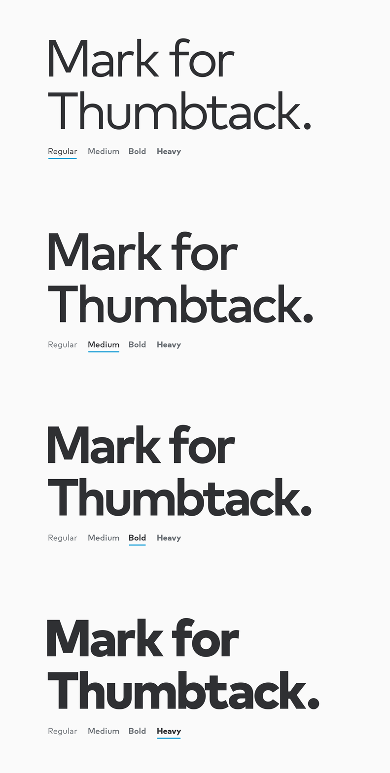
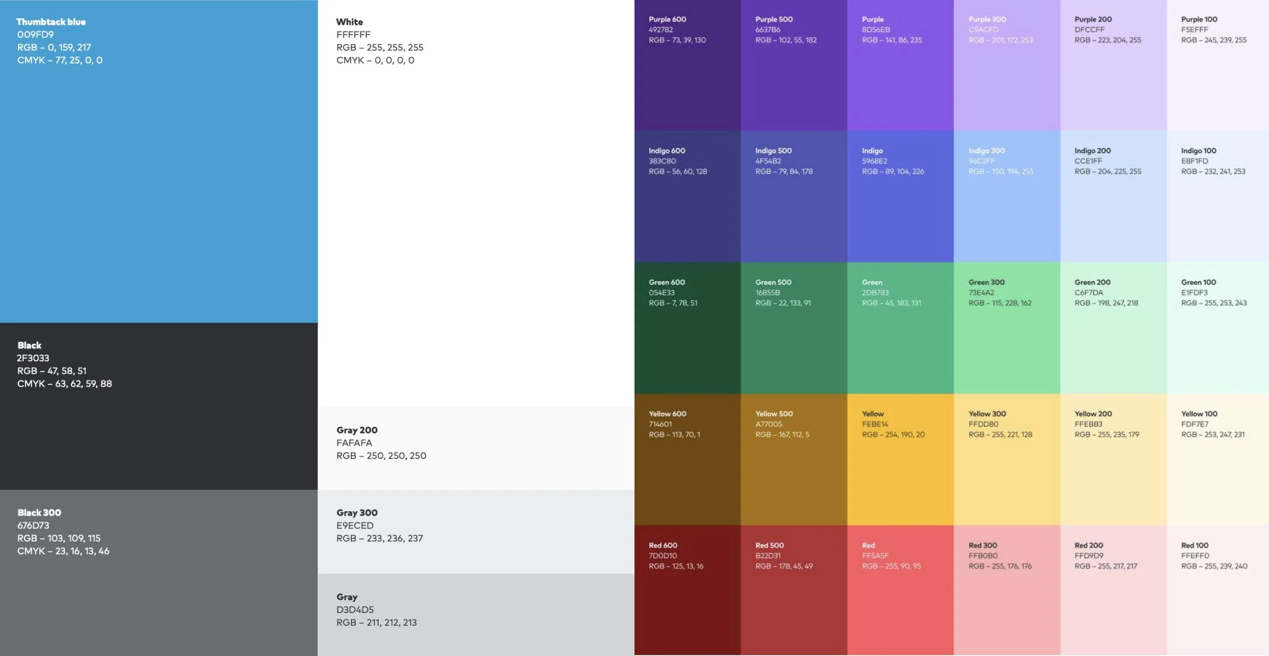
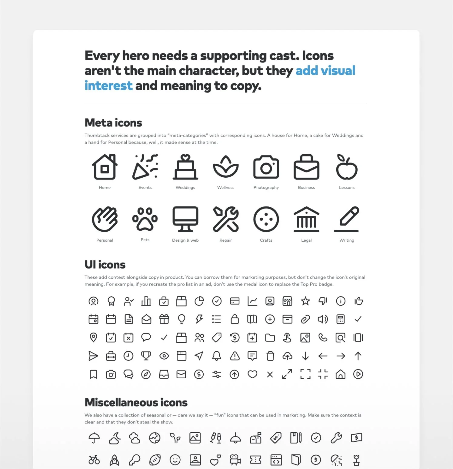
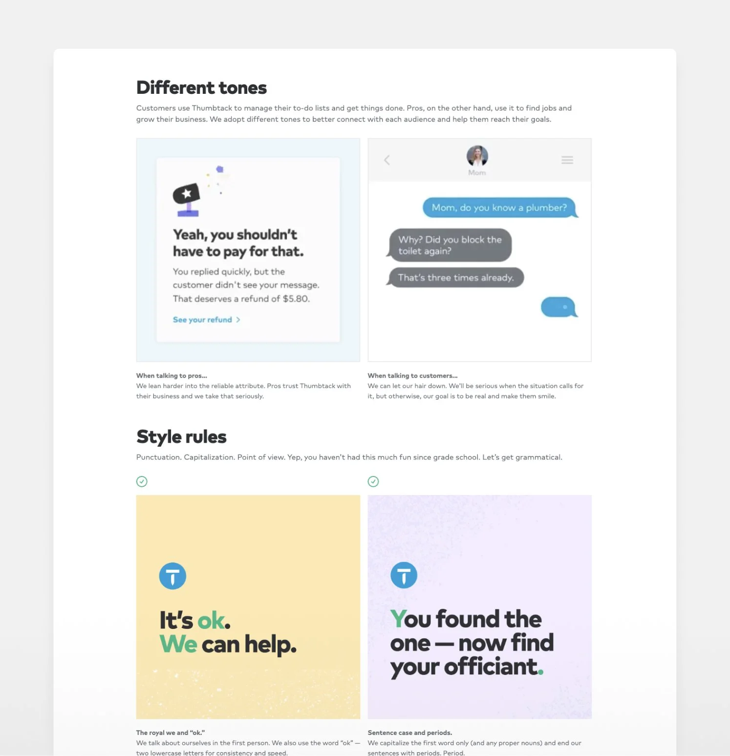
We distilled the audit into a set of core guidelines organized into design, copy, photo and events buckets. We defined key design guidelines like usage of our bespoke typeface (Mark for Thumbtack), solidified our brand icon library, locked in our core brand colors and rules of usage, and outlined our unique photography styles and where to use them — and we finally put pen to paper on defining our unique voice and tone and best practices for hosting engaging events.
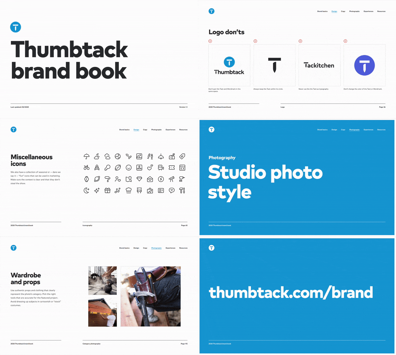
The result was a comprehensive brand book, shared with everyone at the company and key creative vendors. Check out the pdf to dig deeper into our brand guidelines.
THE BRAND MICROSITE
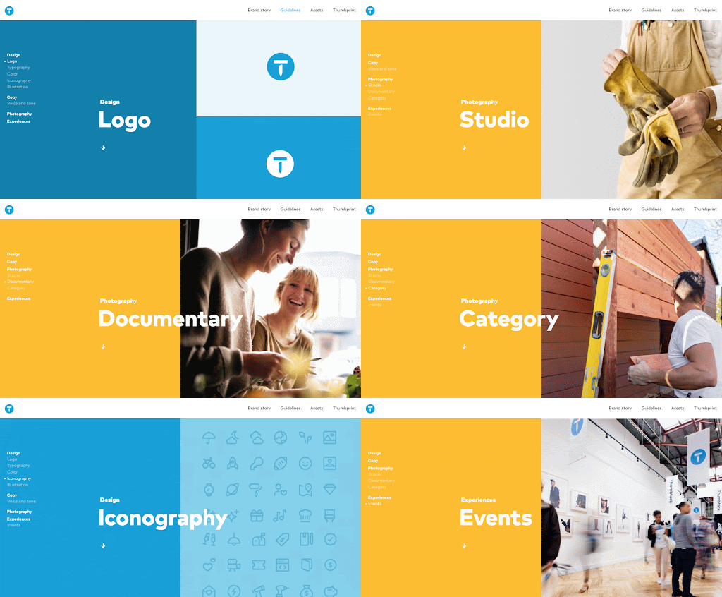
In addition to the brand book PDF, another major deliverable of the project was to develop a microsite to house our brand story, guidelines, and assets. We firmly believed that everybody at Thumbtack was responsible for the brand, and we wanted to empower them with resources to inspire and inform. The goal was to instill this key idea in each employee: Thumbtack has a brand story and guidelines that I should continually reference and can find at thumbtack.com/brand.
EMPOWERING EMPLOYEES
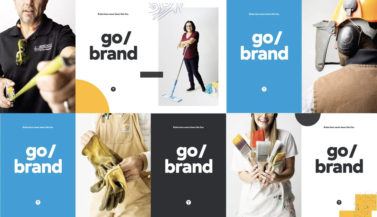
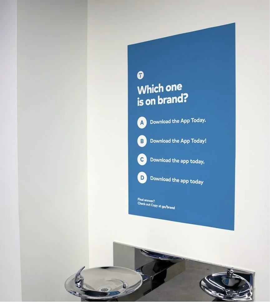
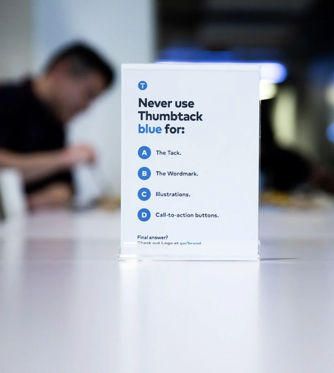
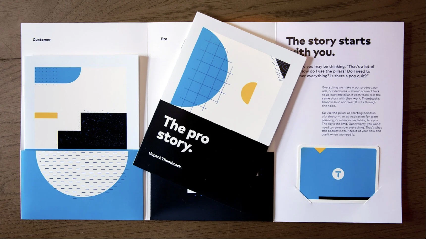
Before launching the site publicly, it was important that we create awareness and drive excitement for Thumbtack employees. In anticipation for the launch, we hung wild posting-style posters and brand knowledge quizzes around the office to drive employees to our internal “go/brand” server link, which housed our guidelines. We distributed brand story booklets to remind people of our key brand pillars and our story as it relates to customers and pros.
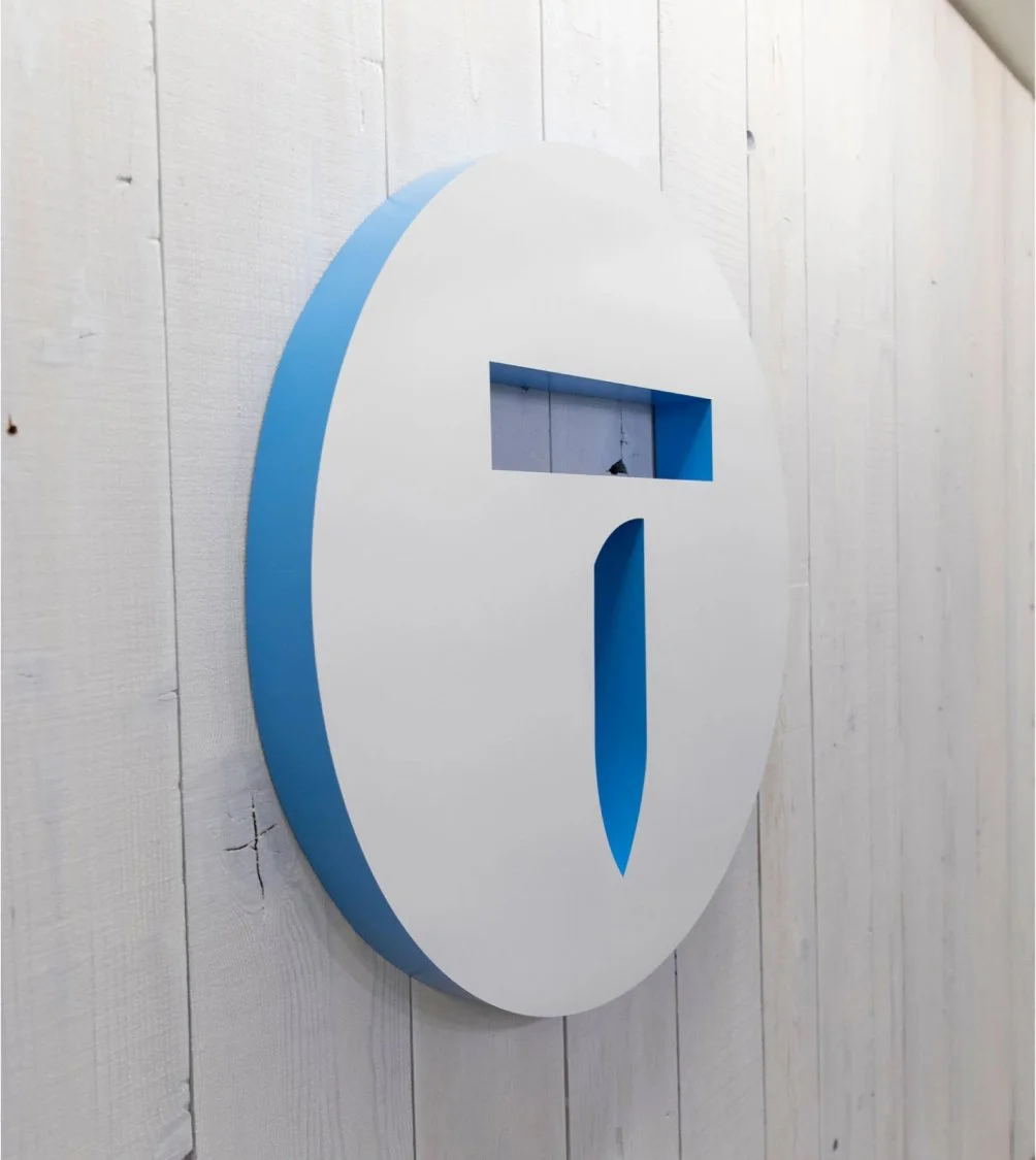
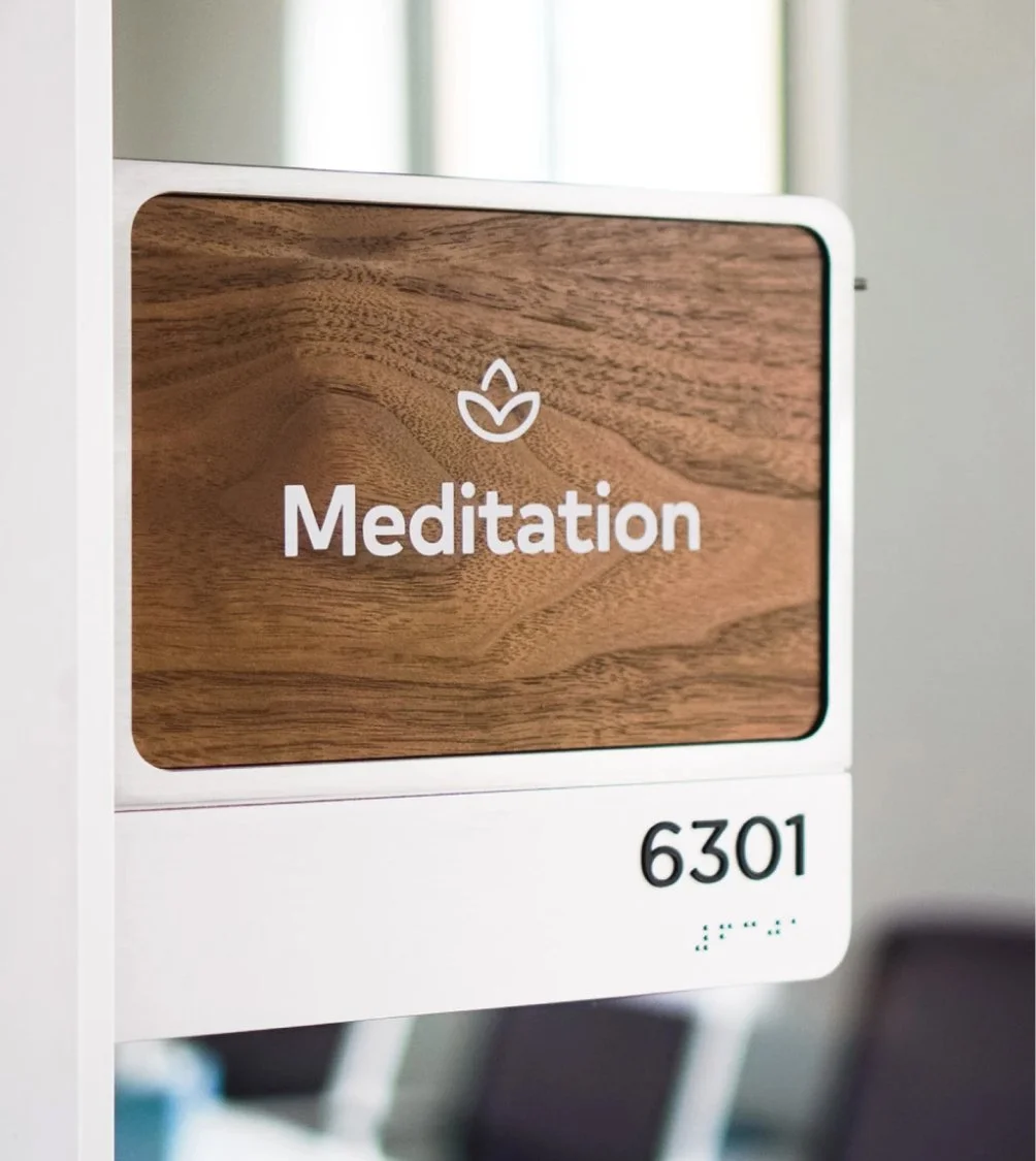
The team also outfitted the Thumbtack headquarters in San Francisco with fresh branded elements, new wayfinding graphics, and photography of our pros to instill a sense of pride and belonging at the office.
FLEXING OUR NEW EXPRESSION
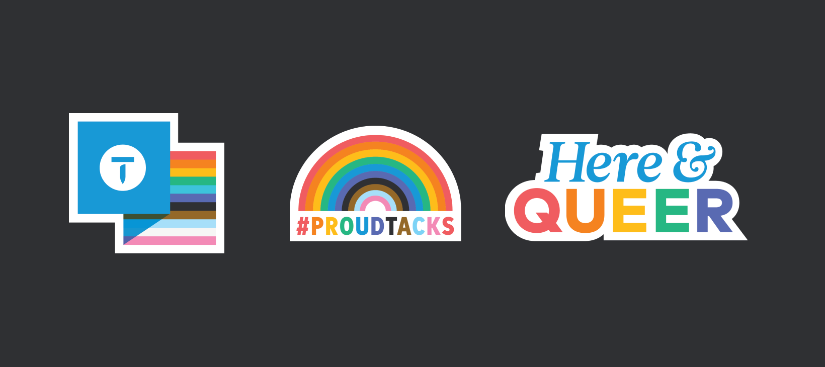
After applying the refresh look, feel, and tone to our highest performing channels like video and paid social, we explored scaling into channels that allowed greater expression and creative exploration — like organic social and employee brand.

