THUMBTACK ILLUSTRATION STYLE
Defining an illustration style that encourages customers to get more done.
Following Thumbtack's 2018 rebrand, the Creative Team identified challenges with the illustration style, feeling it lacked perspective and scalability. The system appeared visually undifferentiated within the tech landscape and failed to effectively represent the experiences of Thumbtack’s two-sided marketplace.
To address these issues, the team partnered with Krystal Lauk of LaukHaus, renowned for her "modern, colorful, and conceptually-driven" style, to redefine and elevate the illustration strategy.
PROJECT GOALS
Create a style that reflects Thumbtack’s fresh identify, feels differentiated in the space, and speaks clearly to both sides of the marketplace.
Execute a hard flip of 60+ illustrations across the platform.
Develop a flexible process to scale our system across product and marketing teams in an efficient way.
Art direction
Illustration
Systems design
Creative operations
MY ROLE
INSPIRATION & CONCEPTING
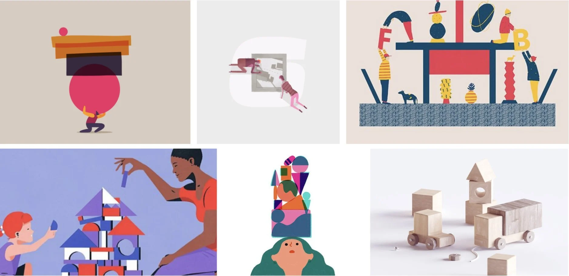
Rooted in our brand values of ease, accomplishment, and possibility, we began exploring various illustration styles to align on the stories we wanted to tell, how to effectively represent the complexity of the Thumbtack platform, and the intended audience for this system. Our initial creative direction focused on portraying users as they navigate challenges, achieve meaningful milestones, and accomplish tasks — both large and small.
EARLY EXPLORATION
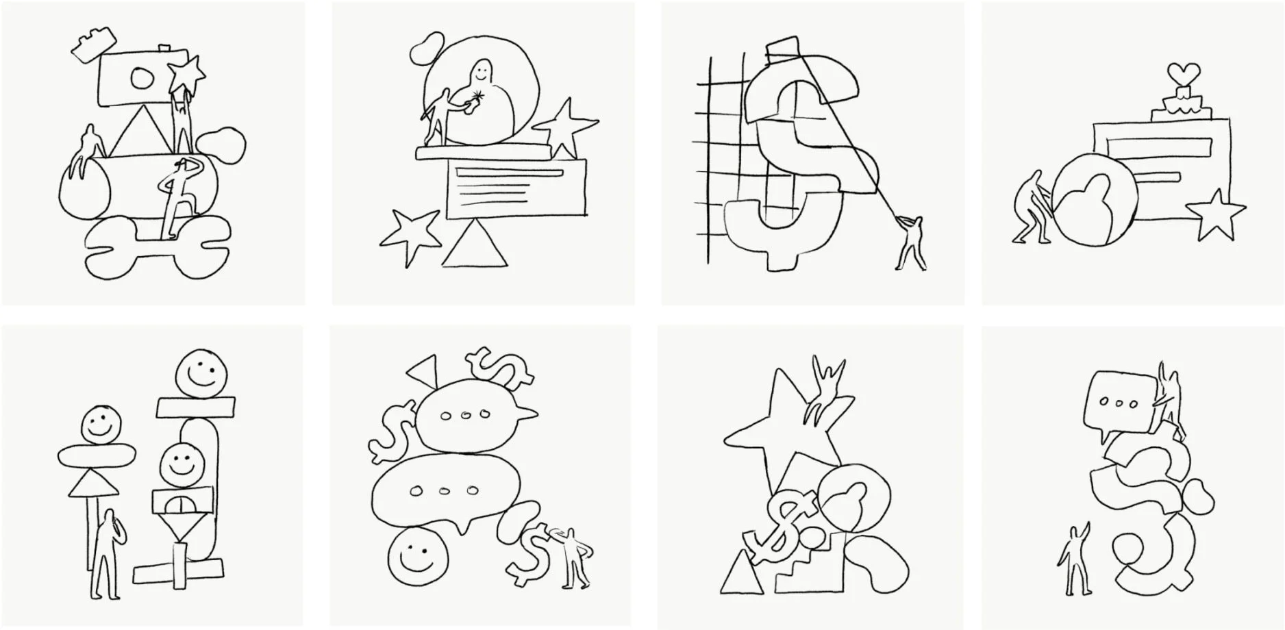
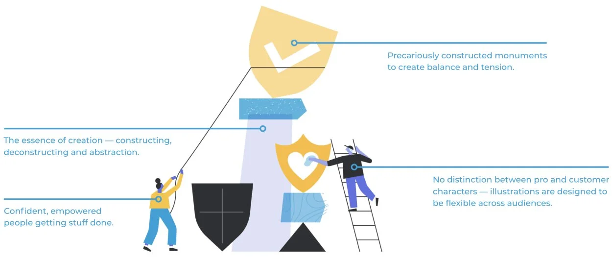
We decided to explore the concept of cairns — small, human-made monuments — as a metaphor to illustrate what Thumbtack empowers professionals and customers to achieve: getting things done. Through this exploration, we recognized that the illustration system needed to do more than communicate Thumbtack's unique offerings and brand values — it also had to tell the meaningful, yet often overlooked, stories of our customer base.
DEVELOPING THE SYSTEM
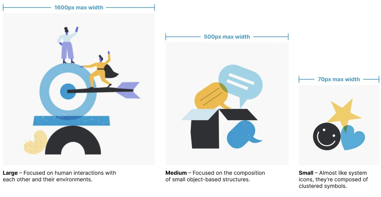
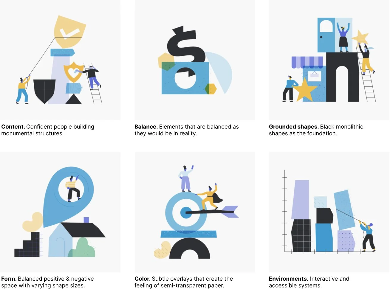
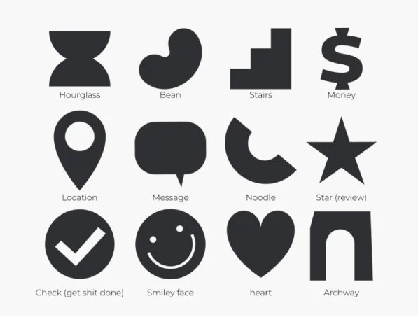
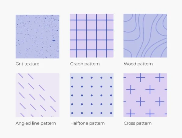
In a variety of sizes and types, we built a robust system of illustrations to scale from impactful brand hero moments to in-platform system icons. To ensure scalability, we developed guidelines for in-house designers to build new illustrations from scratch, anchored on clear principles (content, form, color, etc) and explicit examples for use. Designers were equipped with a library of basic shapes, patterns, and textures to make the creation process swift and cohesive.
Shape & line. Always flat, geometric, and minimalistic.
Patterns & textures. Inspired by real-world materials used by pros, like graph paper and wood.
THE SYSTEM IN ACTION
After developing the new brand illustration style, we partnered with animation studio Very True Story to explore its potential in a narrative format. The style was brought to life through an animated explainer video, showcasing Thumbtack’s virtual-first model, reflecting the company’s adaptability and commitment to employee success during and post-pandemic.
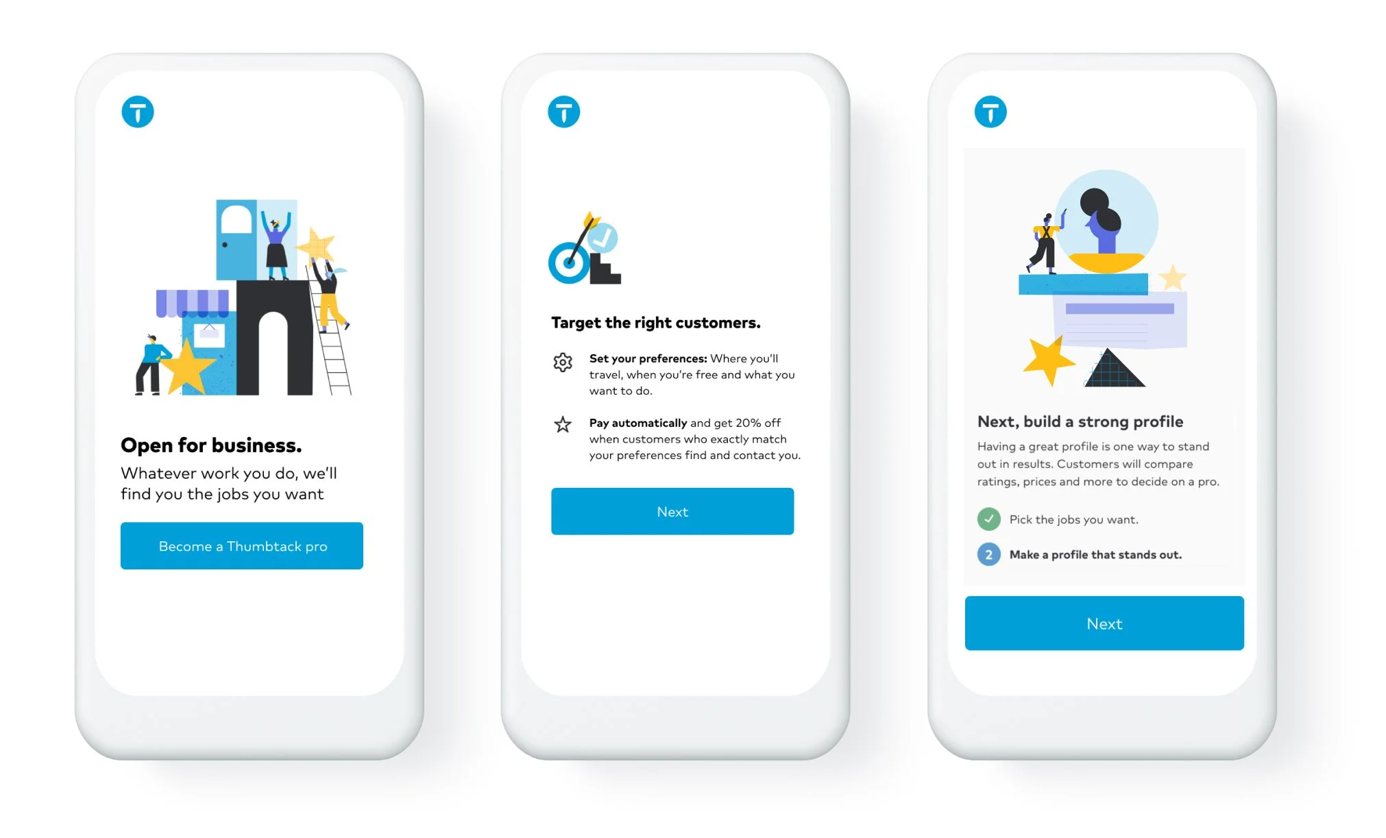
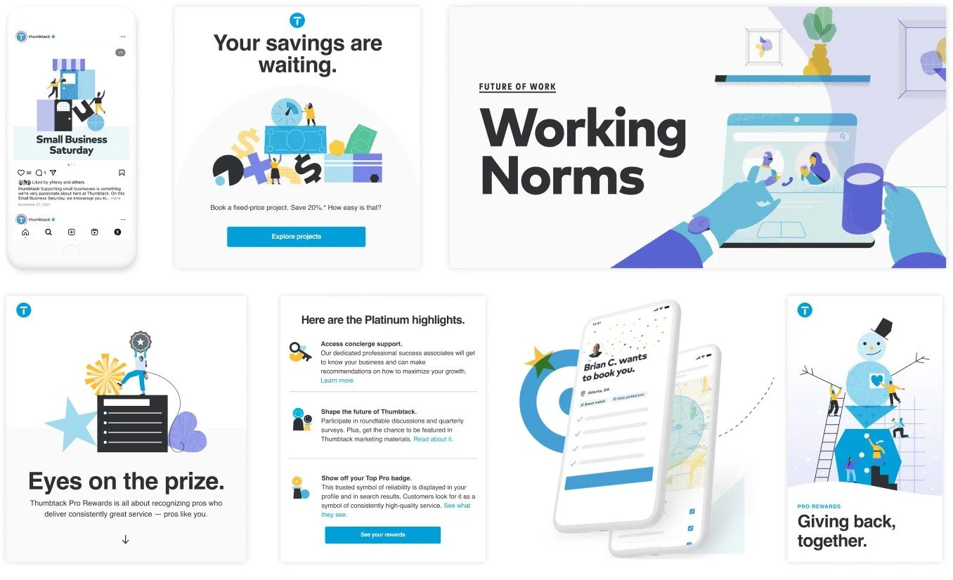
The system was successfully integrated into product onboarding flows, marketing campaigns, social media, and even brought to life in motion through collaboration with creative studio The Little Labs. Its flexibility and scalability have enabled it to consistently support business objectives while maintaining a distinctive creative style that endures over time.
SCALING THE SYSTEM WITH TOOLING
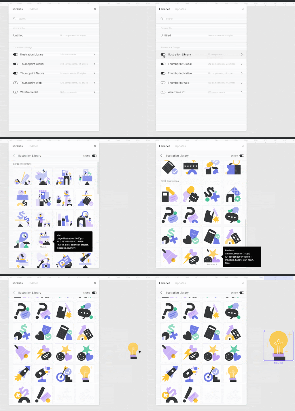
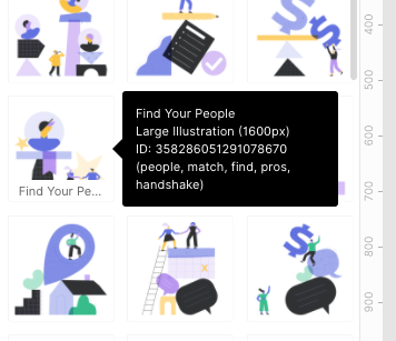
As a final step to solidify an air-tight process, the team leveraged Figma libraries to make the system immediately accessible to the folks who would use it everyday — designers and developers. In close collaboration with Product Design, we shipped a fully-searchable and accessible library, embedded right in our design software. Each illustration was given a description with title, size, ID, and additional keywords to help designers and developers source the right illustration, and guarantee design/code parity.
